Architecture Rant Redux
Reading a recent story in the Globe & Mail reminded me of my earlier rant on the effect modern architecture has on the usability of buildings:
Another problem I have is that, over and over again, these name-recognized buildings sacrifice usability and positive occupant experience in favor of appearance. It goes against my philosophy of substance over flash and appearance. This problem is typical for what is called "magazine architecture"—other critics will laugh when you talk about adding a usability survey when evaluating the architectural value of a building. Services don't work, spaces overheat or are too cold, rain leaks in, etc.
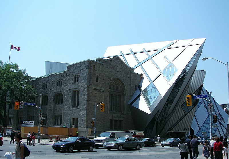
The article was a story on the Daniel Libeskind addition to the Royal Ontario Museum:("Leaks, woes a smudge on Crystal's sparkle")--the previous blog post has a construction photo, showing the crystal growth off the side of the building.

To cite the article:
Good thing it was a dry summer. The new Michael Lee-Chin Crystal at the Royal Ontario Museum, Toronto's most talked-about new edifice, leaks.
At least, it did leak. Water penetrated the north end of the long window of the C5 restaurant, and puddles have appeared near windows on the third and fourth floors.
As winter approaches, fingers are crossed that there will be no more puddles, and that the Crystal's cladding, designed to prevent it from turning into an avalanche-maker, will function as well in cold reality as it does in theory. But it's clear, four months into the Crystal's life, the new spaces pose huge challenges, and leaks are the least of them.
This was no surprise to me. I have decided that in my field, my alarm bells for "future building failure imminent" go off if I hear the terms: (1) "fast-track," (2) "value engineered," or (3) "award-winning."
As some of my commentors pointed out, it is the most tragic that these failures of the building end up giving the collection short shrift--both in terms of potential damage to the items, and the loss of museum resources to fixing problems caused by the building:
The problem of installing artifacts in a space with no vertical walls challenged Hiroshi Sugimoto, the first artist to be exhibited in the ROM's fourth-floor Institute for Contemporary Culture. ...
Special new display cases have been bought to match the galleries, some with trapezoidal shapes. As well, the renovation has opened the entire building, old and new parts, to more daylight, which risks bleaching museum artifacts. So the museum has acquired special blinds that filter out 96 per cent of ultraviolet light, as well as blackout blinds that block exterior light.
“Daniel didn't design this building based on the collections,” said Mr. Rahimi (director of gallery development). “We had to design the collections to go with the building. We have an aesthetic imperative – partly because the architecture is so strong.”
And that last quote is simultaneously telling, depressing, and infuriating. However, it is not at all surprising.


4 Comments:
There was a nice letter from William Thorsell, the CEO of the ROM (and former Editor-in-Chief of the G+M, not coincidentally) the next day that said, "um, the reports of trouble at the ROM are greatly exaggerated."
I think it's more than a bit ridiculous looking, but I won't really know how I feel about it until I see something important in it. The Darwin exhibit doesn't open for another year.
Yes, I saw that letter as well. It was filtered through the thought of, "Well, he is in a position where he would want to spin the problems in the most positive light."
Also, the winter will be the most trying time--not just because of water leaks, but because of condensation of interior air. Museums condition to 50% RH, which is basically a recipe on how to cause air leakage condensation in buildings.
Whenever I see buildings like the ROM, I always remember a comment by a denizen of the Stata Center, who said in essence "Well, at least *my* office has a vertical wall in it for my books."
It seems like the height of arrogance to design a building and give no consideration to the uses its occupants will put it too. But maybe, in some way, that's the point of a vanity building.
Jen L
You know, form can follow function and still be beautiful. Many of my favorite examples of industrial design prove it. Come to think of it, many of my favorite buildings do, too.
It just seems like the height of arrogance to design a museum addition in *spite* of the art within, rather than because of it.
Maybe they should give out an I.M. Pei award for this sort of thing.
Post a Comment
<< Home