Fun with Cartograms!
Grr.. WYSIWYG HTML editor in this new blogger is really broken.
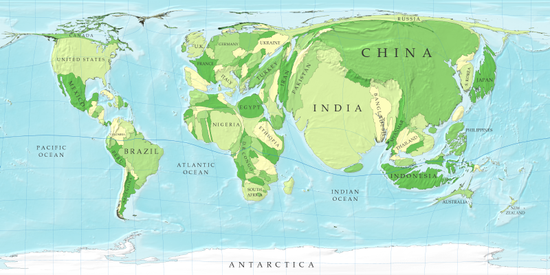
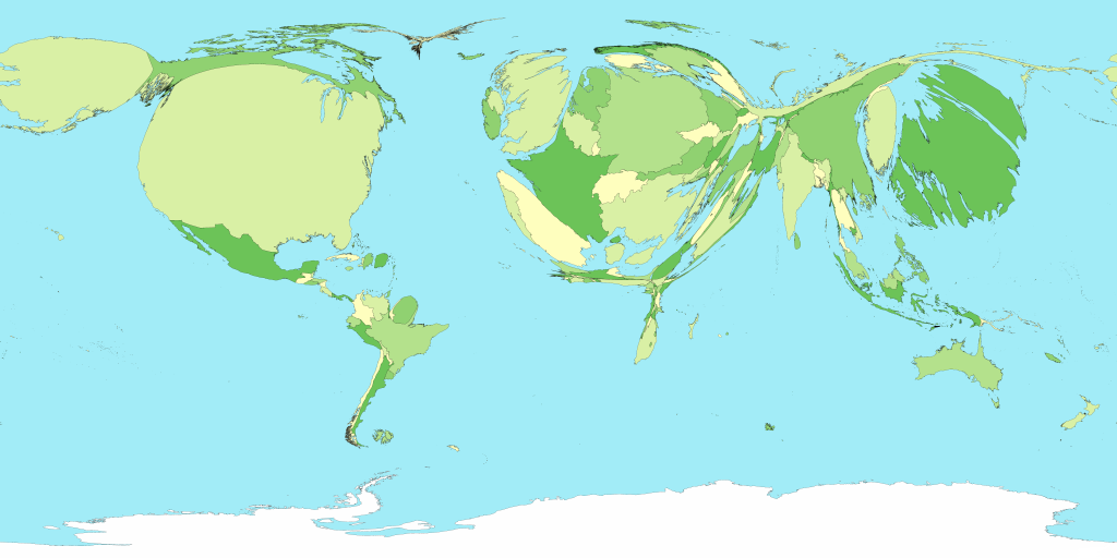
For those of you not familiar with cartograms, they are maps with the size of areas (states, countries, counties) rescaled to provide an indication of a metric (typically population). I figure that most of you saw the 2004 election results (red state/blue state) as cartograms. But anyway, the same researcher did a bunch of world maps using various social and economic metrics, and I thought they were pretty cool. The one above is the world normalized by population. Yeah, check out India. Yeah, there's a reason why we're outsourcing all this work to there--that large of a population, with a decent education system. Yikes. Another neat map on that page is countries by gross domestic product Check out the relative proportions of Africa and Japan.
posted by Bats @ 11:24 AM
4 comments
![]()


4 Comments:
Awesome! Post to eit.
A cool site linked from the original one: a whole bunch of world cartograms:
http://www.sasi.group.shef.ac.uk/worldmapper/
One cool one pointed out to me by Del--world toy exports:
http://www.sasi.group.shef.ac.uk/worldmapper/display.php?selected=57
believe you didn't mention this one:
http://www.sasi.group.shef.ac.uk/worldmapper/display.php?selected=38
Yay shipping containers!
Post a Comment
<< Home